Zendesk Responsive Themes
All of our themes were made to support just about any device possible. Your customers won't even notice the difference using different devices.

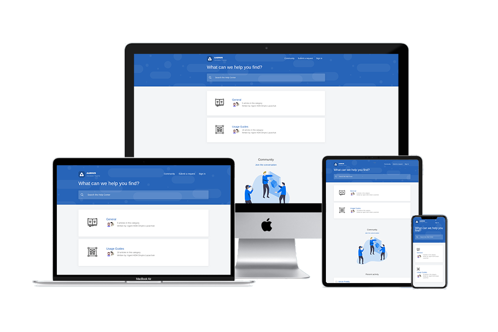
Views For Every Device
Depending on the device, your viewing experience may differ as certain elements are repositioned. Hence why it is critical that you cover these different layouts in your Zendesk help center. After all, many users prefer to view things on non-conventional devices such as tablets, smartphones, and others.
It is estimated that around 66% of internet users are viewing things on their mobile devices. This is why we made sure that our themes are modular and adaptable. You will have absolutely zero issues using and viewing our themes.


Expert customization for better customer experience
Better help center experience is one step away
Transform your customer support with GrowthDot's
cross-browser compatible themes and powerful Zendesk
customization. Our optimized solutions ensure seamless
performance, sensible design, and consumer-friendly
experiences across all devices.


