A public help center enables businesses to engage with customers and build strong relationships. Help Centers are a large part of customer service. Furthermore, an organization's revenue is largely contingent on its customer support/help center. Help center design is also essential to customer support, as is an eye-catching design. Simple navigation grabs the attention of current and future clients and builds confidence through its overall look and usability.
Zendesk Help Center Design Essentials and Designs to Get You Inspired
Designs by GrowthDot
GrowthDot offers ready-made Zendesk Guide themes designed to make Help Centers more modern, branded, and easier to navigate while keeping Zendesk’s core functionality. The current theme collection includes Aarhus, Odense, and Aalborg, with customization options available for branding and layout changes.
Aarhus
Aarhus is a clean, modern Zendesk theme focused on usability and structured knowledge-base navigation. It includes customizable colors and icons, advanced article formatting, a Table of Contents, sidebar navigation, Prev/Next buttons, and alerts.
Odense
Odense offers a minimalist Help Center design focused on content readability. It supports custom colors and icons, advanced article formatting, Table of Contents and sidebar navigation, plus Prev/Next navigation and alerts.
Aalborg
Aalborg is the newest of the three and follows a sleek, contemporary UI approach. Its simple design is intended to work across different industries without overpowering a company's branding. It also includes customizable colors and icons and enhanced article formatting.
Here are examples of our clients' help centers:
Also, our team will gladly add a personal touch to your company, so feel free to contact us for branding and customization options for your Zendesk Knowledge Base!
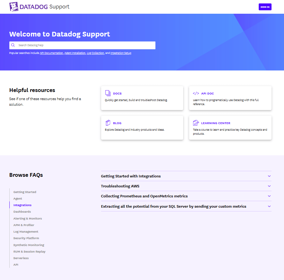
1. DataDog
The DataDog Help Center has a clean, professional B2B SaaS design focused on fast access to information rather than visual complexity. The homepage starts with a prominent search area and popular searches, helping users quickly find answers without navigating through multiple categories. It also includes direct links to key resources such as documentation, API documentation, the blog, and the Learning Center. Here are some other things their implementation got right:
- Clean, professional B2B SaaS design focused on usability rather than visual decoration
- Product-based navigation makes it easy to find content for specific Datadog products
- Direct links to Docs, API Documentation, Blog, and Learning Center
- FAQs are surfaced directly on the homepage, reducing the number of clicks needed to find answers.
- Combines support documentation with educational and training resources.
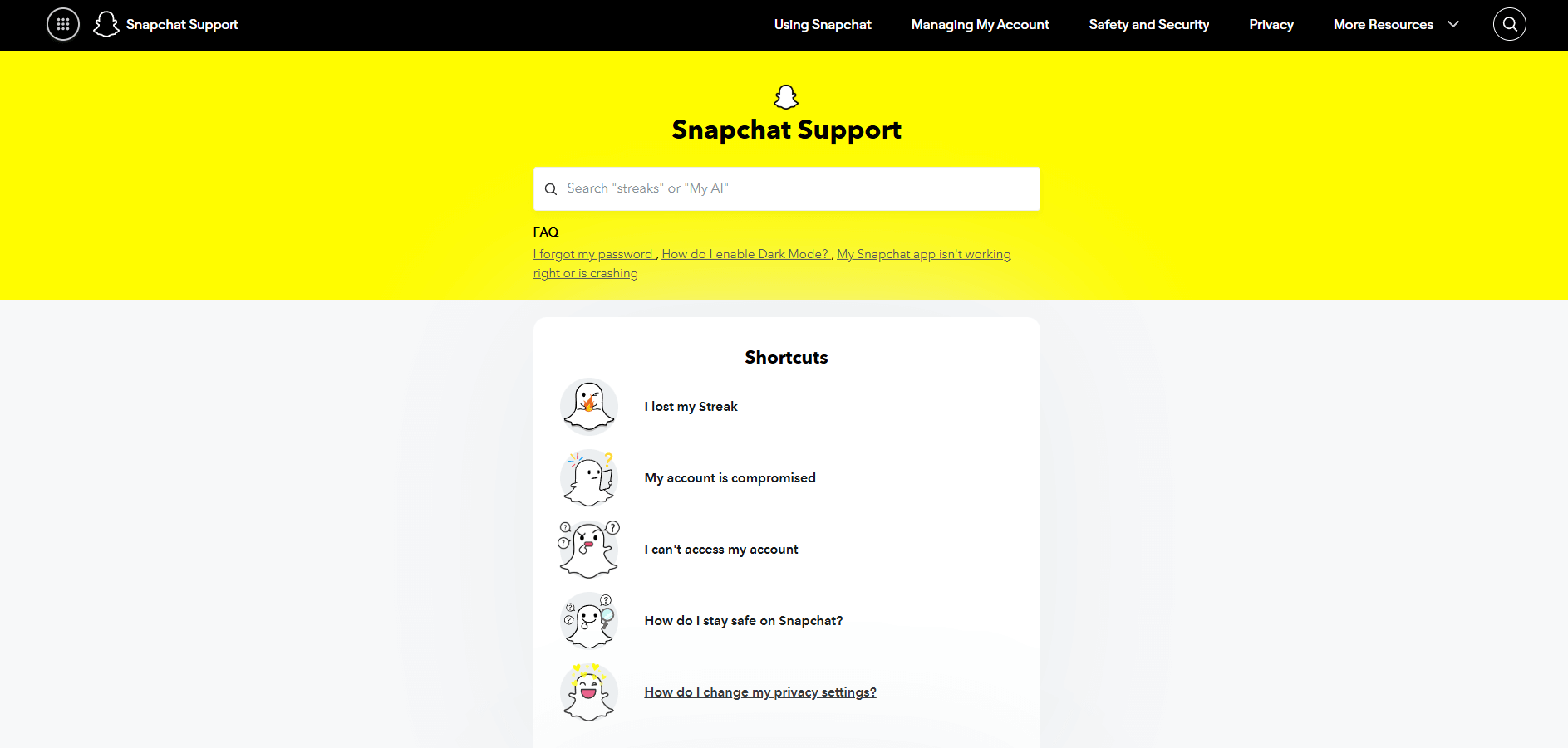
2. Snapchat Support
Snapchat support impresses users with the highest brand consistency. The use of Snapchat Yellow and the signature typeface confirms a smooth transition from the app to the web support portal. Also, it has:
- Intuitive navigation where the search bar is at the top of the page
- Great example of user-centric UI/UX
- Visual hierarchy & iconography
- "Problem-first" categorization.
3. DeepL Help Center
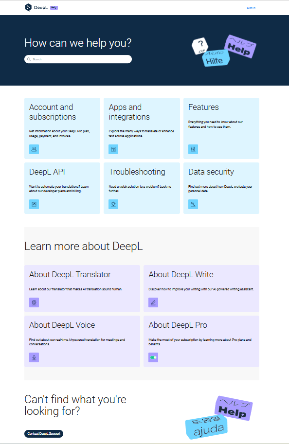
DeepL’s Help Center uses a clean, minimalist design with a prominent search bar and a clear “How can we help you?” entry point. Its navigation is simple and well organized, with categories based on products and user needs, including Account & Subscriptions, Apps & Integrations, Features, API, Troubleshooting, and Data Security.
Notable implementations:
- Clean, minimalist design with a prominent search bar and a clear “How can we help you?” entry point
- Simple, well-organized navigation with categories based on products and user needs, including Account & Subscriptions, Apps & Integrations, Features, API, Troubleshooting, and Data Security
- Strong focus on self-service support
- Provides multiple support paths, including customer support, community resources, API documentation, and a Trust Center, making it easy for different types of users to find relevant information.
4. Deezer Help Section Design
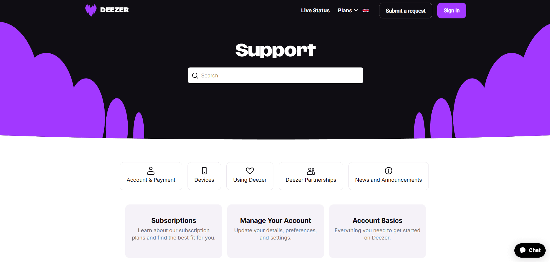
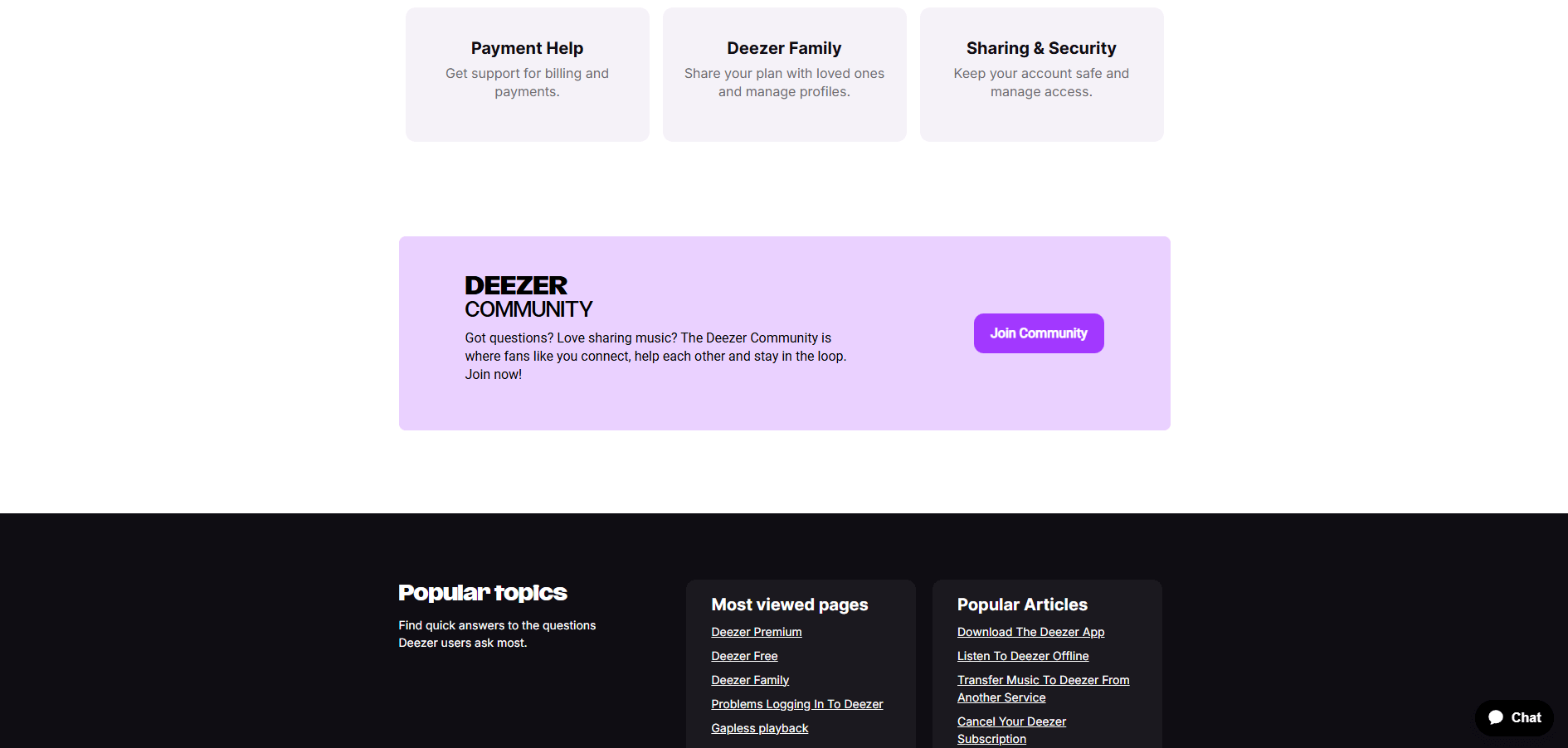
Deezer, a music streaming platform, should also be included in the list of best help center examples. It focuses on a "clean-to-complex" hierarchy, ensuring users can find answers without feeling overwhelmed. Here are the benefits of this layout:
- The large, centered search bar is the top point, allowing users with specific issues to skip browsing
- Logical grouping. Related topics like "Payment Help" and "Deezer Family" are grouped together
- Appealing high-contrast design
- Hierarchical arrangement of sections from the Top level to the footer.
5. Kickstarter Help Center
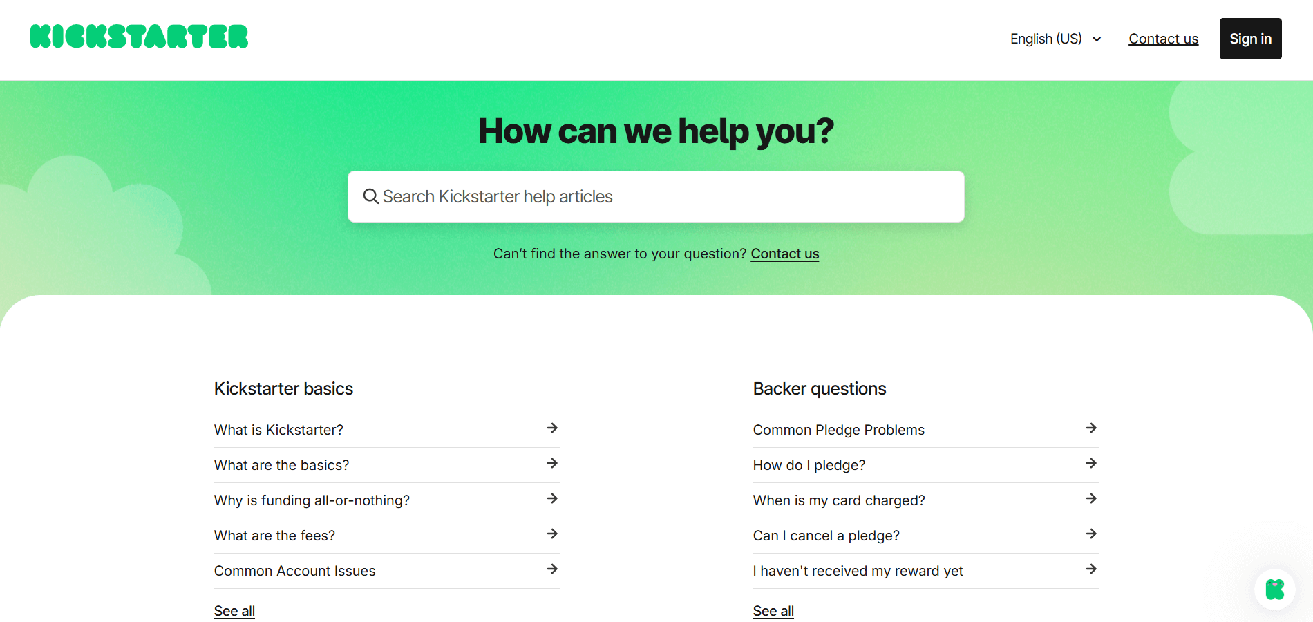
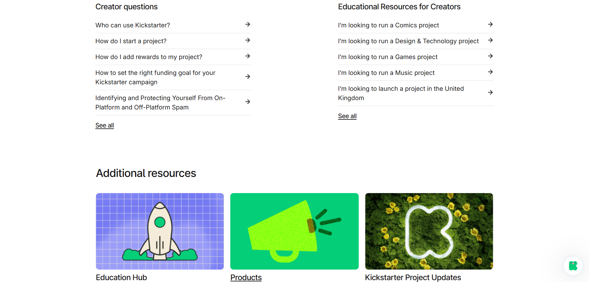
The design of this Kickstarter Help Center prioritizes clarity, accessibility, and user-centric navigation. It also minimizes mental overload and helps people find answers quickly by categorizing information based on the user's role (Backer vs. Creator). Their customer support hub has the following features:
- Bold headings and plenty of white space keep the page from feeling overwhelming, even though it contains a lot of information.
- The layout immediately separates content into clear buckets based on why a user is visiting
- A "Contact us" link is placed directly under the search bar and in the top header if you haven't found a problem-solving solution. Also, a Chat Widget (the green icon in the bottom right) is available for real-time assistance.
6. Calendly Help Center
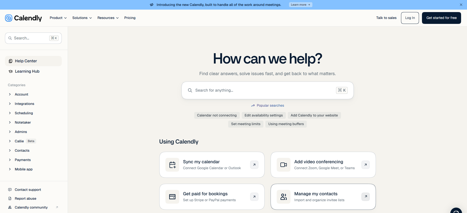
Calendly’s Help Center uses a clean and intuitive structure that makes it easy for users to find relevant information. A prominent search bar provides quick access to answers, while clearly organized categories help visitors navigate topics related to scheduling, accounts, integrations, and administration. The homepage also highlights popular tasks, letting users reach common solutions in fewer clicks.
- The clean, minimalist layout makes the Help Center easy to scan.
- Visual cards make resources such as the Learning Hub and API documentation more engaging.
- Popular tasks are highlighted for quick access to common solutions.
- Content is organized into clear categories such as Account, Integrations, Scheduling, and Admins.
7. Figma Help Center
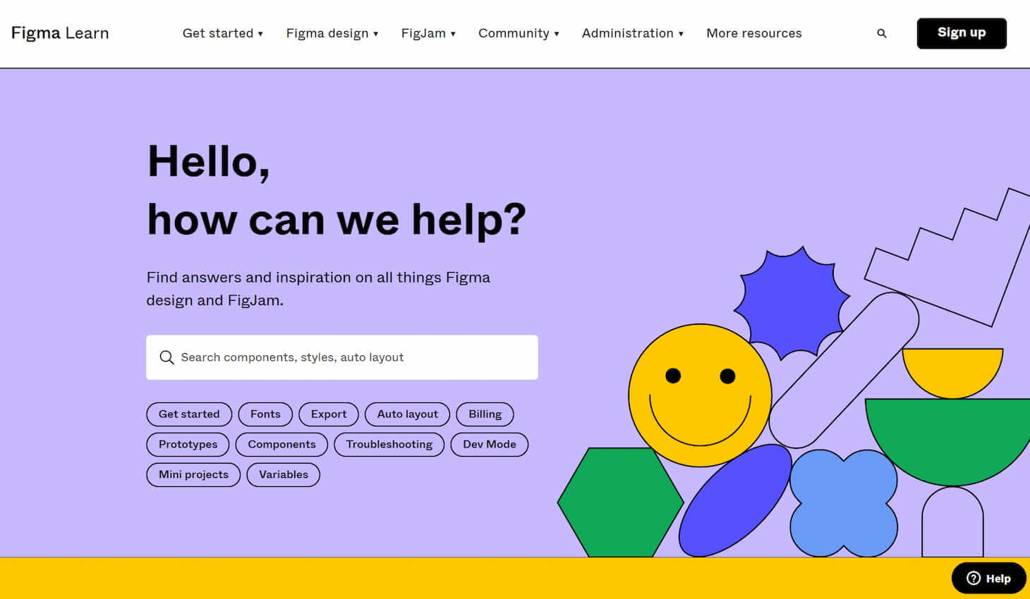
Like Dropbox, Figma takes a creative and artistic approach to designing its help center. The bright colors and eye-catching images reflect the company’s brand style, making the help center an excellent extension of that brand!
8. Intel Support
Intel is a world leader in essential technologies, and as expected, its help center organizes categories neatly. The support page uses violet and blue as part of the design, which feels high-tech and reinforces the brand. Except for its well-done structure, the most notable feature is that they offer clients to update their drivers automatically. This suggests the company found that the most searched topic was updating drivers. So, users don't need to read all articles on this topic.
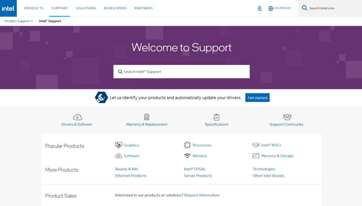
By the way, from the Support page, users can leave feedback, contact the support team, or address support for the community.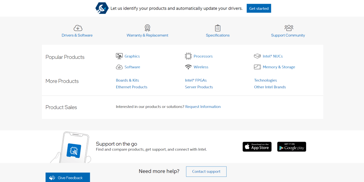
Considering this, analyze your main search queries and make their help center interaction one hundred percent useful.
9. Miro Help Center
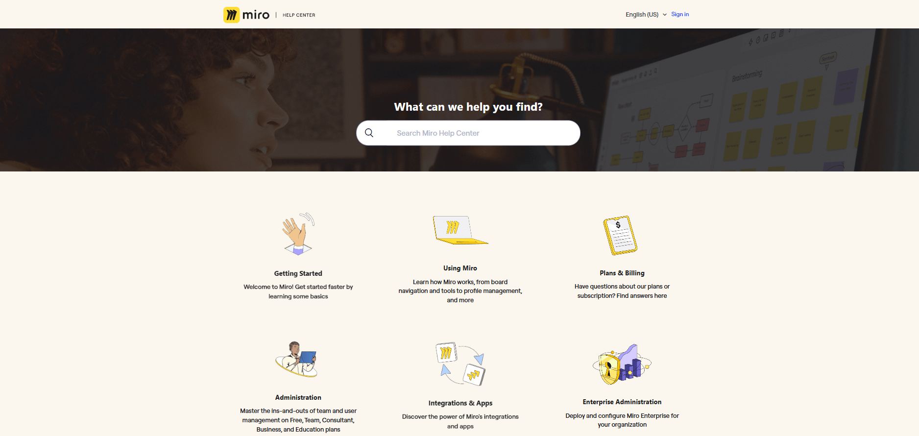
The Miro Help Center design is built to empower users through a "self-service first" approach. Their approach to help center design is simple yet creative. Accordingly, helpful information is paired with striking visuals that draw attention. Based on the Help Center's structure and features, here are the primary benefits of its design:
- The design organizes complex technical information into distinct, digestible categories with engaging visuals.
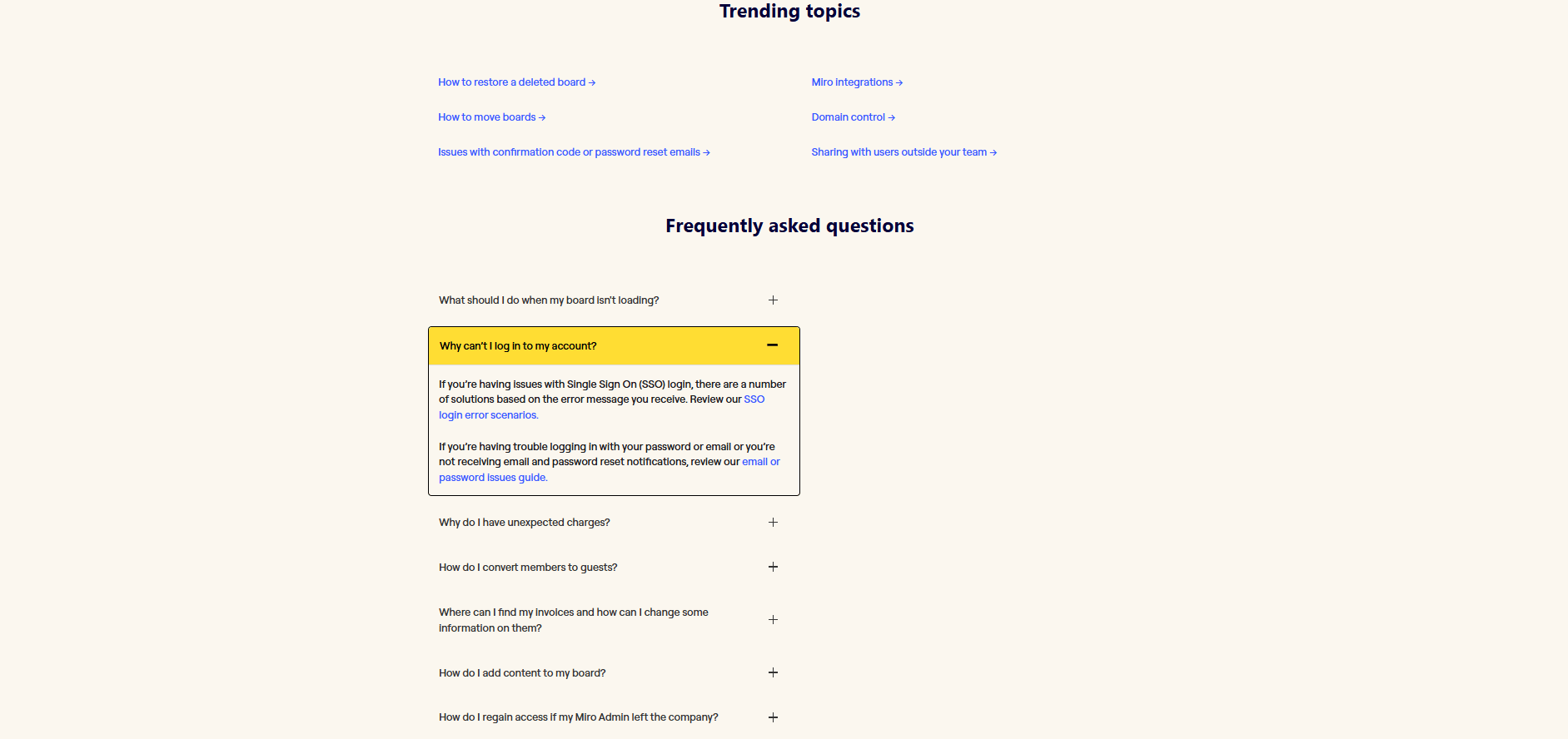
- A dedicated "Frequently Asked Questions" section, accessible via a drop-down, directly shows high-volume issues such as board-loading problems, login errors, and unexpected billing charges.
- Clear paths allow users to understand exactly where they are within the documentation hierarchy, making it easy to jump back to broader categories
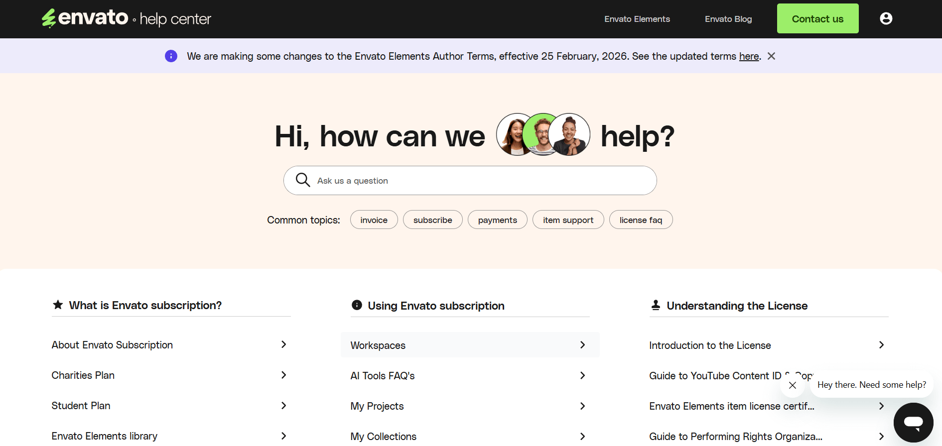
10. Envato
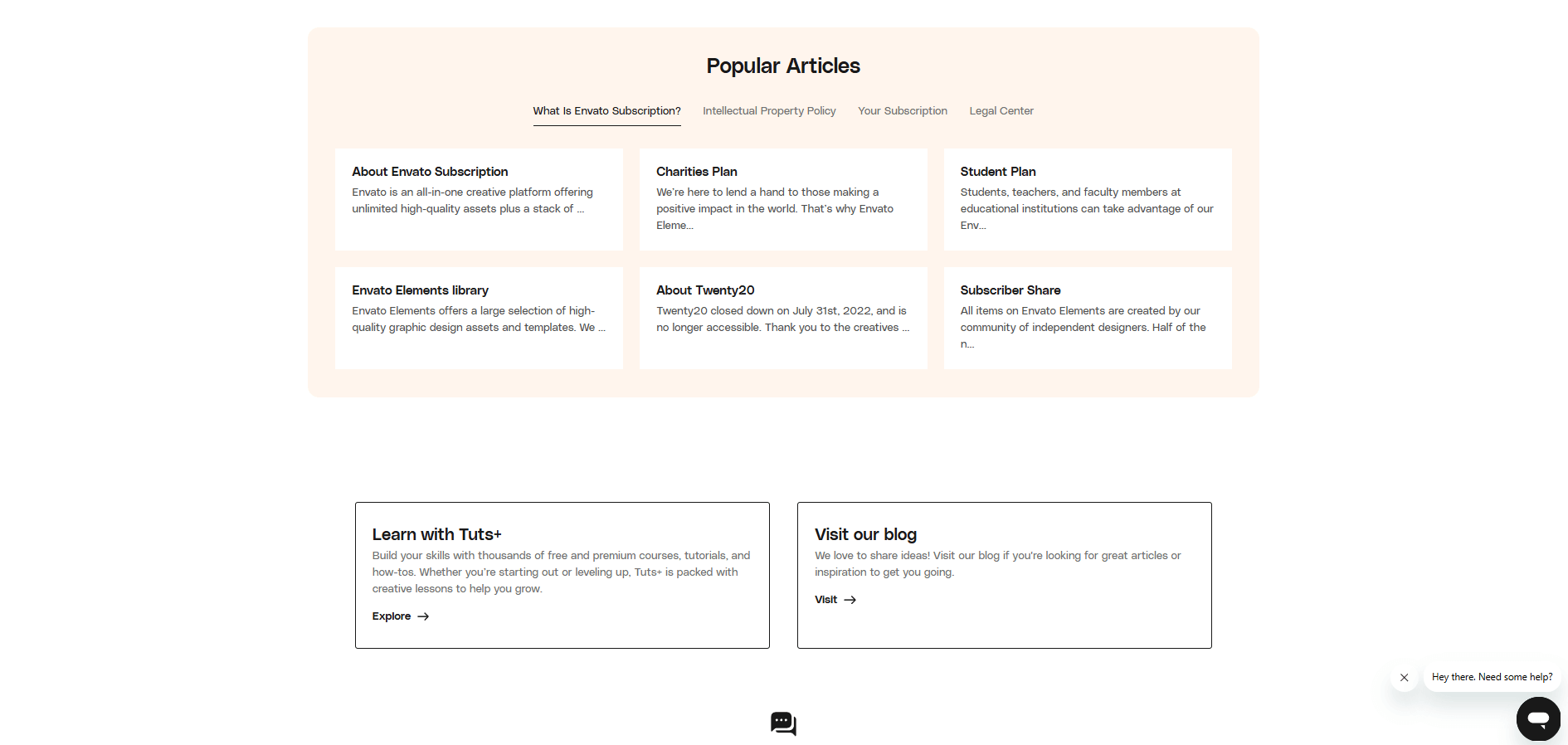
Based on the images provided, the Envato Help Center design is built around accessibility and speed. It balances a welcoming, human-centric aesthetic with a highly organized layout that minimizes the time users spend searching for answers. Here are the primary benefits of this design:
- Multi-Layered Navigation
- Iconography, whitespaces, sectioned tabs
- Soft and warm background
11. TomTom
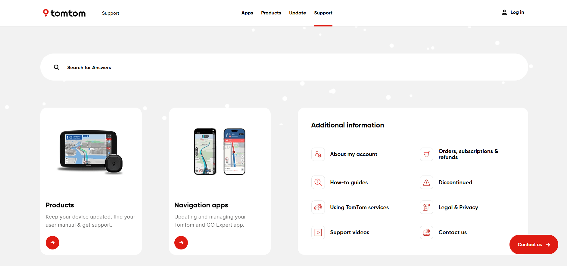
While the Envato design focuses on a lifestyle-driven, human-centric approach, the TomTom Help Center is designed with a technical, product-first philosophy. Since TomTom deals with complex hardware (Sat Navs) and various software platforms, its design focuses on technical clarity and device identification.
12. Vueling
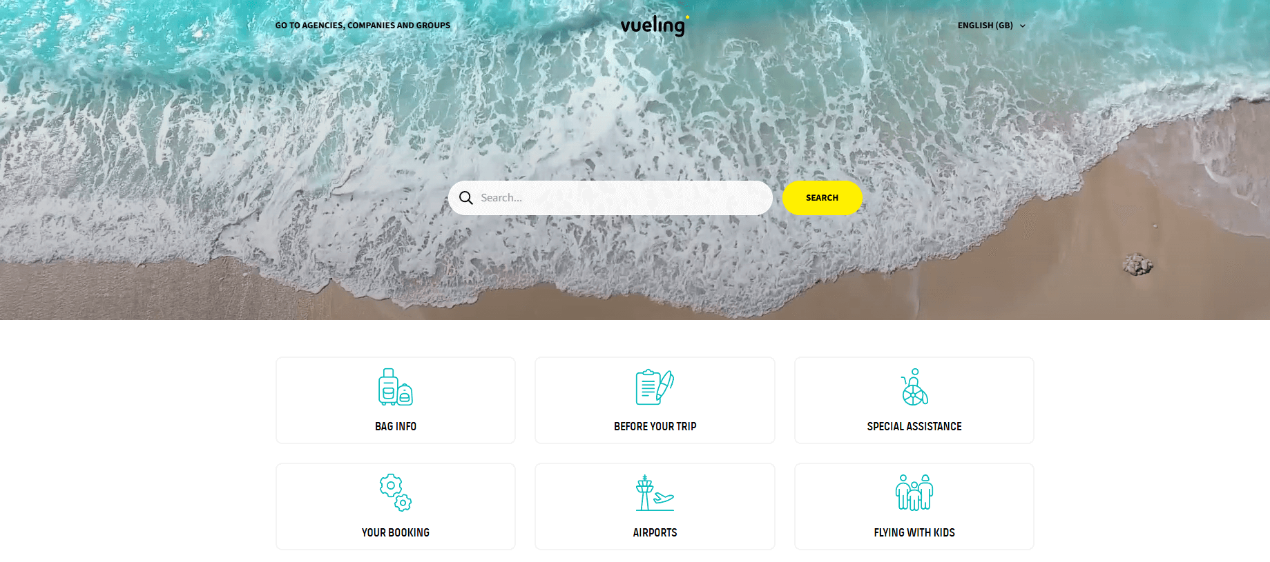
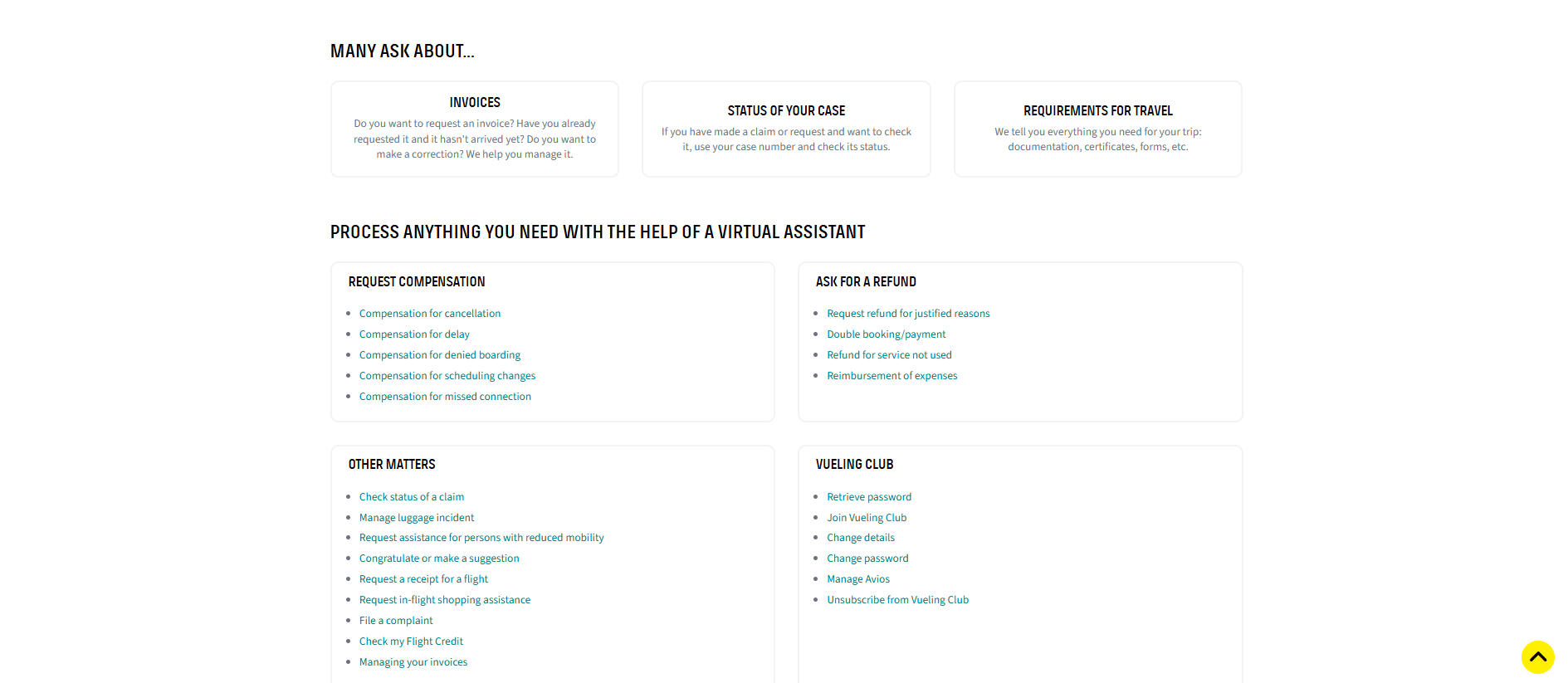
The Vueling Help Center is the airline's centralized self-service platform that helps passengers manage their travel independently and resolve issues without calling a representative.
Here are the primary benefits and features of using the portal:
- Appealing and airy design
- MANY ASK ABOUT... section, where you can see the most popular queries
13. Izzi Help Center
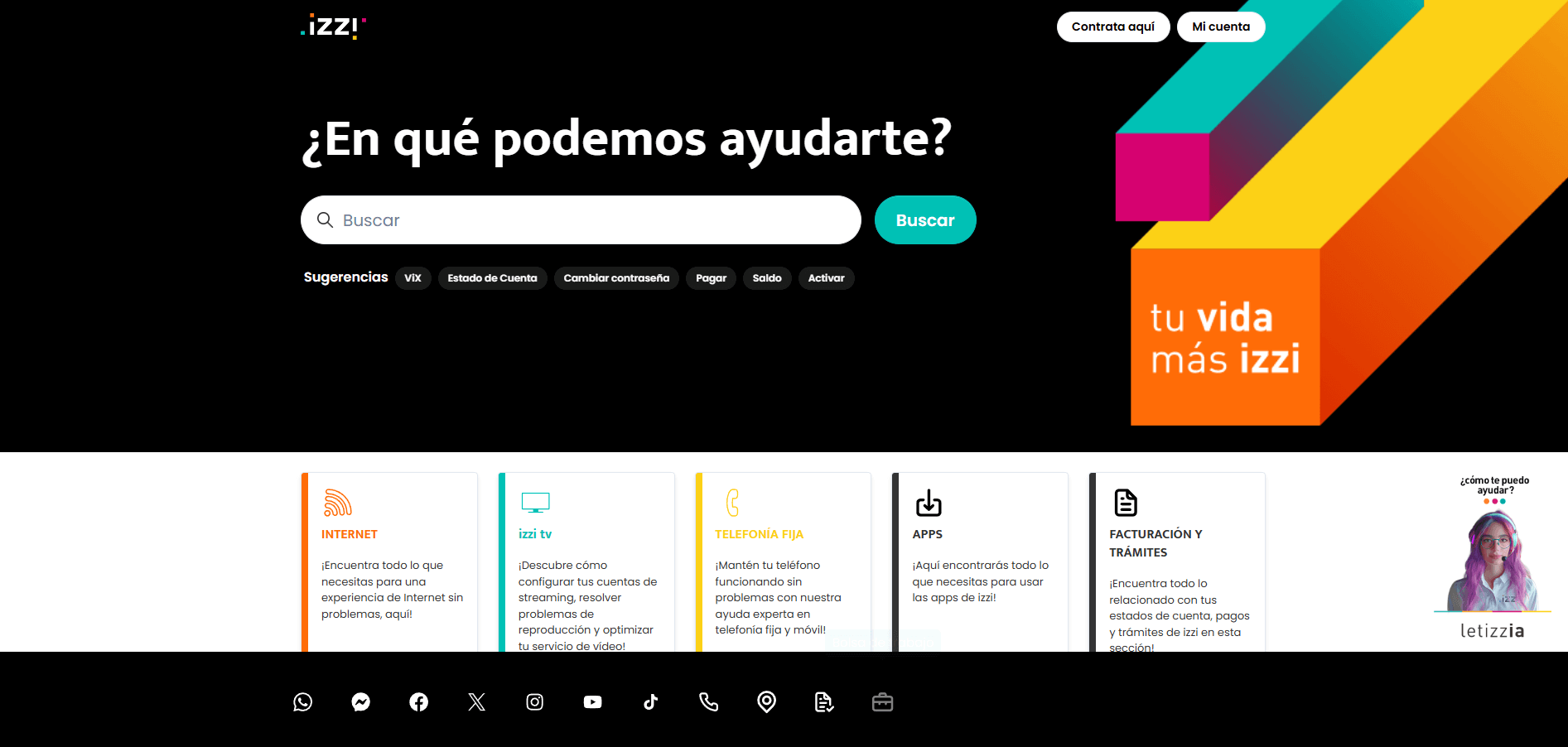
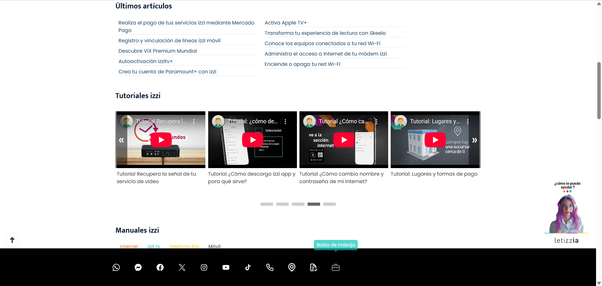
When you're dealing with internet or TV issues, the last thing you want is a complicated manual or a long wait on the phone. The Izzi Help Center is a "DIY" hub that lets you skip the line and fix things yourself.
Here is a breakdown of what you actually get out of it:
- Instead of using tech jargon, the design uses clear, simple icons for things
- Attention to video content
- The page is broken down into three main sections: Internet, TV, and Phone.
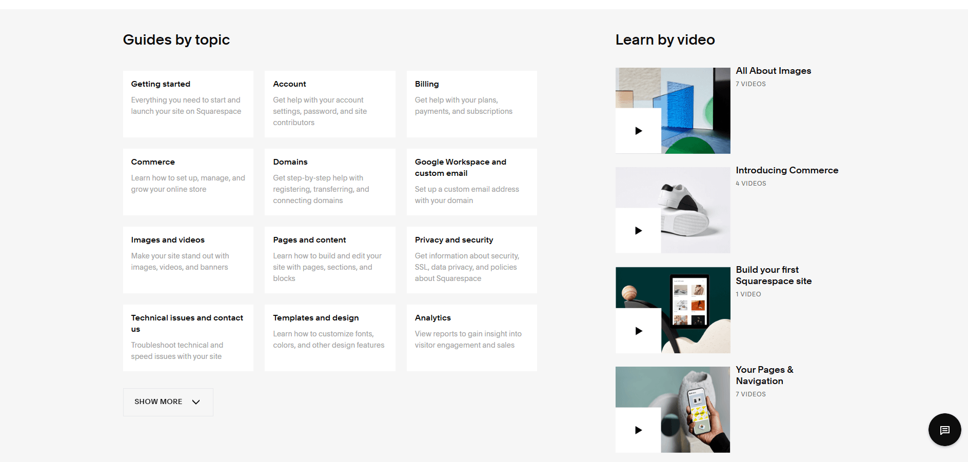
14. Squarespace Help Center
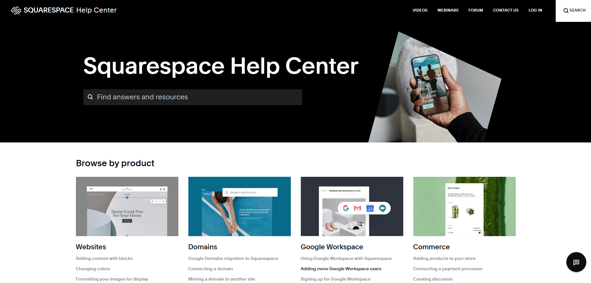
When you look at the Squarespace Help Center, you’ll notice it feels very different from a typical "tech support" site. It’s designed to look more like a high-end blog or a digital magazine than a manual. Here’s why that design is actually helpful for you:
- Minimalist and not scaring you away
- Big, bold categories
- Clear "paths" for help. The design doesn't hide the "contact us" button. If you scroll to the bottom of any article, there’s a clear section for "Still need help?" with direct links to live chat or email.
15. De Lijn Help Center
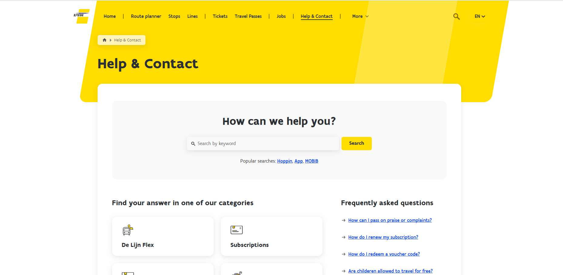
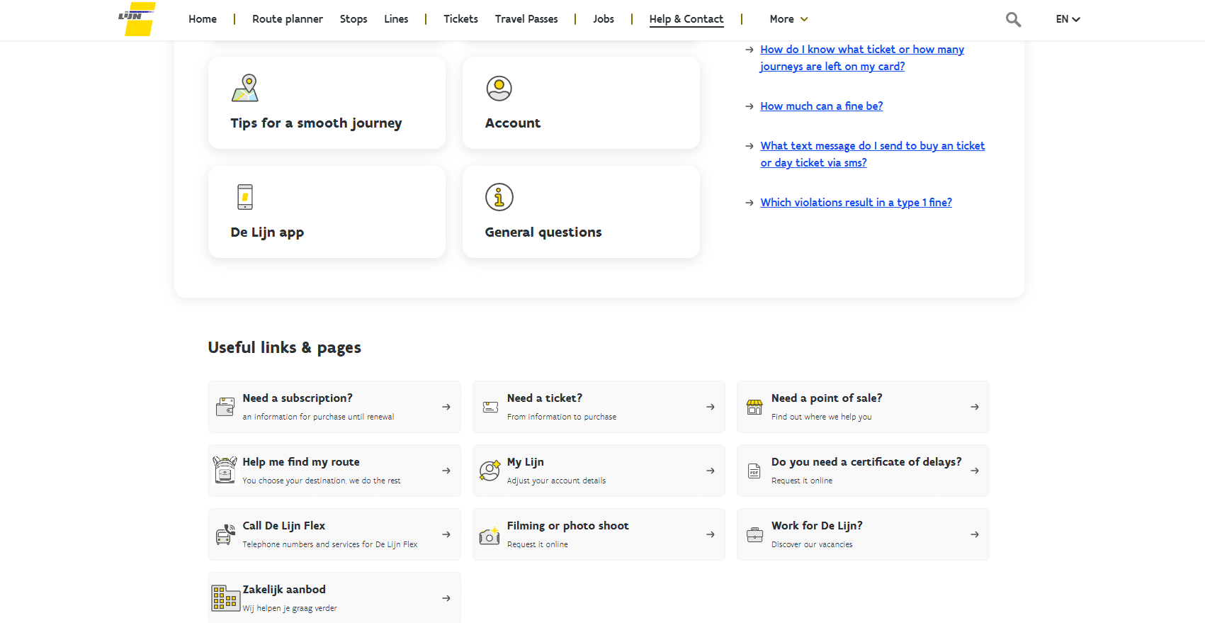
The De Lijn Help Center (the Belgian public transport company) is designed for people who are likely on the move, stressed about a bus schedule, or trying to figure out a ticket while standing at a stop. Here’s why the design actually works for a user:
- Mobile-first simplicity. Because most people check transport info on their phones while standing outside, the design is incredibly "thumb-friendly."
- Clear icons for "Real-world" problems
- The Search Bar is the "Hero"
Final Words
Well, you've learned some thoughtful help/support center designs. They all have:
- Unique features that help people;
- A search bar;
- Marvelous and simple designs that reflect brands;
- Easy-to-navigate instructions, and so on.
This article will undoubtedly serve as a valuable guide to help you to draw inspiration from various help centers and design a custom Zendesk theme. Furthermore, we hope these examples from familiar services will help you make an exceptional help center that will offer solutions to many user problems.
FAQ
Help Center Design