A public help center enables businesses to engage with customers and build strong relationships. Help Centers are a large part of customer service. Furthermore, the revenue generated by the organization is very much contingent on its customer support/help center. Help center design is also an essential attribute in customer support as an eye-catching design. Along with simple navigation, it grabs the attention of your current and future clients and builds confidence through its general view and usability.
So, the equation is simple: you please the customer, and the customer returns the favor! Primarily, self-service has become one of the main Saas company's ways of providing customer support. Therefore, tutorials and technical troubleshooting are helpful for clients in understanding the product or service usage steps that are involved. Usually, they expect from help centers a clear, user-driven language, interaction, an engaging interface, sometimes a voice search, and, surely, easy-to-follow instructions. Finding a starting point when creating a help center or redesigning your existing one might be challenging. To that end, read about the essentials of designing a help center and the twenty help center designs to get some inspiration.
Zendesk Help Center Design Essentials and Designs to Get You Inspired

1. Etsy Help Center
The Etsy Help Center's look complements the style of their main website perfectly. It has a neat, simple layout that allows for easy, swift navigation, a search bar, and several featured articles at the top of the page. You can also get assistance and support via Etsy's community forums. Here are some other things their implementation got right:
- The first thing you see is a search bar
- Instant help with an order
- Separate categories for different searches (i.e., one for sale and one for shopping)
- The result page isn't endless and has clear pages, making it more digestible on smaller-screen devices
- The cookie notification isn't intrusive and does not block the search bar.
 2. Snapchat Support
Snapchat support impresses users with the highest brand consistency. The use of Snapchat Yellow and the signature typeface confirms a smooth transition from the app to the web support portal. Also, it has:
- Intuitive navigation where the search bar is at the top of the page
- Great example of user-centric UI/UX
- Visual hierarchy & iconography
- "Problem-first" categorization.

3. Midjourney Support Page Design
The standout feature of the Midjourney help center is its focus on creative education and technical mastery. Moreover, the layout follows a "Video-First" approach to guide users through a brief introduction to generative AI.

Notable implementations:
- Thumbnail-driven learning and visualization
- A dedicated AI chat assistant is integrated into the help portal and trained specifically on Midjourney's documentation to provide instant answers to technical questions
- Dedicated billing portal.

4. Deezer Help Section Design
Deezer music streaming platform should also be included in the list of best help center examples. It focuses on a "clean-to-complex" hierarchy, ensuring users can find answers without feeling overwhelmed. Here are the benefits of this layout:
- The large, centered search bar is the top point, allowing users with specific issues to skip browsing
- Logical grouping. Related topics like "Payment Help" and "Deezer Family" are grouped together
- Appealing high-contrast design
- Hierarchical arrangement of sections from the Top level to the footer.


5. Kickstarter Help Center
The design of this Kickstarter help center contains clarity, accessibility, and user-centric navigation. Besides, it minimizes mental overload and helps people find answers quickly by categorizing information based on the user's specific role (Backer vs. Creator). Their customer support hub has the following features:
- Bold headings and plenty of white space prevent the page from feeling overwhelming, even though it contains a large amount of information.
- The layout immediately separates content into clear buckets based on why a user is visiting
- A "Contact us" link is placed directly under the search bar and in the top header if you haven't find a problem solving. Also AChat Widget (the green icon in the bottom right) is available for real-time assistance.


6. Dropbox Help Center
The Dropbox help page boasts a very captivating design that genuinely reflects the company's brand. The content on their help page is not just run-of-the-mill help center content. On this platform, you will also find several informative guides and an array of video tutorials for those who seek visual assistance with their queries/concerns.

7. Figma Help Center
Like Dropbox, Figma takes a creative and artistic approach to designing its help center. The use of bright colors and eye-catching images totally reflects the company’s brand style, making the help center an excellent extension of that brand! 
8. Intel Support
Intel is a world leader in producing essential technologies, and as expected, categories are neatly organized in its help center. The support page design has violet and blue colors used as a part of the design and is associated with the high-tech reminding users about the company itself. Except for its well-done structure, the most notable feature is that they offer clients to update their drivers automatically. It means that the company found out that the most searched topic was on updating drivers. So, users don't need to read all articles on this topic.

By the way, from the Support page, users can leave feedback, contact the support team, or address support for the community.
Considering this, analyze your main search queries and make their help center interaction one hundred percent useful.
9. Miro Help Center
The Miro Help Center design is built to empower users through a "self-service first" approach. Their approach to help center design is simple yet creative. So, all helpful information is accordingly accompanied by striking visuals that draw attention. Based on the Help Center's structure and features, here are the primary benefits of its design:
- The design organizes complex technical information into distinct, digestible categories with engaging visuals.
- A dedicated "Frequently Asked Questions" section, accessible via a drop-down, directly shows high-volume issues such as board-loading problems, login errors, and unexpected billing charges.
- Clear paths allow users to understand exactly where they are within the documentation hierarchy, making it easy to jump back to broader categories


10. Envato
Based on the images provided, the Envato Help Center design is built around accessibility and speed. It balances a welcoming, human-centric aesthetic with a highly organized layout that minimizes the time users spend searching for answers. Here are the primary benefits of this design:
- Multi-Layered Navigation
- Iconography, whitespaces, sectioned tabs
- Soft and warm background


11. TomTom
While the Envato design focuses on a lifestyle-driven, human-centric approach, the TomTom Help Center is designed with a technical, product-first philosophy. Since TomTom deals with complex hardware (Sat Navs) and various software platforms, its design focuses on technical clarity and device identification.

12. Vueling
The Vueling Help Center is the airline's centralized self-service platform that helps passengers manage their travel independently and resolve issues without calling a representative.
Here are the primary benefits and features of using the portal:
- Appealing and airy design
- MANY ASK ABOUT... section, where you can see the most popular queries


13. Izzi Help Center
When you're dealing with internet or TV issues, the last thing you want is a complicated manual or a long wait on the phone. The Izzi Help Center is a "DIY" hub that lets you skip the line and fix things yourself.
Here is a breakdown of what you actually get out of it:
- Instead of using tech jargon, the design uses clear, simple icons for things
- Attention to video content
- The page is broken down into three main sections: Internet, TV, and Phone.


14. Squarespace Help Center
When you look at the Squarespace Help Center, you’ll notice it feels very different from a typical "tech support" site. It’s designed to look more like a high-end blog or a digital magazine than a manual. Here’s why that design is actually helpful for you:
- Minimalist and not scaring you away
- Big, bold categories
- Clear "paths" for help. The design doesn't hide the "contact us" button. If you scroll to the bottom of any article, there’s a clear section for "Still need help?" with direct links to live chat or email.


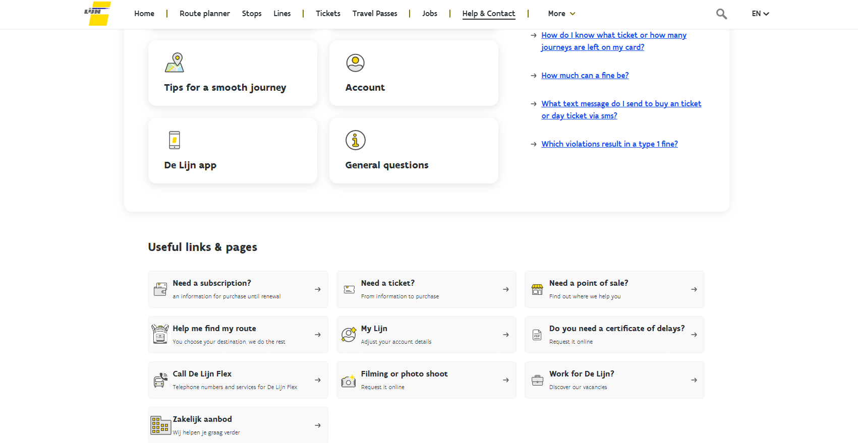
15. De Lijn Help Center
The De Lijn Help Center (the Belgian public transport company) is designed for people who are likely on the move, stressed about a bus schedule, or trying to figure out a ticket while standing at a stop. Here’s why the design actually works for a user:
- Mobile-first simplicity. Because most people check transport info on their phones while standing outside, the design is incredibly "thumb-friendly."
- Clear icons for "Real-world" problems
- The Search Bar is the "Hero"

Final Words
Well, you've learned some thoughtful help/support center designs. They all have:
- Unique features that help people;
- A search bar;
- Marvelous and simple designs that reflect brands;
- Easy-to-navigate instructions, and so on.
This article will undoubtedly serve as a valuable guide to help you to draw inspiration from various help centers and design a custom Zendesk theme. Furthermore, we hope these examples from familiar services will help you make an exceptional help center that will offer solutions to many user problems.
Help Center Design FAQs
How to design a help center?
Designing a help center involves setting clear goals, understanding user needs, and organizing information logically. Consider utilizing services like GrowthDot, which specializes in creating Zendesk help desk design. Ensure a user-friendly interface, maintain brand consistency, and regularly update content to reflect changing requirements.
What should be on a help center page?
Help center best practices typically include a search bar, categorized content, FAQs, contact information, tutorials, troubleshooting resources, community forums, feedback mechanisms, language options, and SEO optimization to enhance help center UX and accessibility.
How can I test the effectiveness of my support page design?
To evaluate the effectiveness of your help center page design, start by tracking user behavior through analytics, examining search queries, bounce rates, and the time spent on articles. Gather feedback via surveys or feedback widgets directly on the page. A/B testing different layouts or navigation structures can also reveal which design better supports your users. Most importantly, monitor ticket deflection rates; fewer support requests often indicate a more successful design.
What are some common mistakes in help center design?
A few frequent mistakes in help page UI design include cluttered layouts, poor mobile optimization, hard-to-read fonts, and burying important articles deep in the navigation. Another issue is not aligning the UI with your brand, which can make the experience feel disconnected. Avoid overly complex language or technical jargon. Clarity always wins in support content.
Bonus! Aarhus, Odense and Aalborg themes from GrowthDot
GrowthDot team designed a custom help center theme for Zendesk specifically. It takes into consideration all the recommendations mentioned below as well as suits all Zendesk features and details. So, find any element needed for a great help center design. Our Aarhus, Odense, and Aalborg themes are wonderful Zendesk help center examples, including a visible header, sidebar navigation, categories with customizable icons, "Prev"/"Next" buttons, and many more. In addition, themes are accessible on any device and enable extra formatting elements such as tables of contents, callout blocks, internal tabs, and other options to help you design your help center content in the way you want. We also create custom themes for Zendesk Guide and offer considerable discounts. Check out our Zendesk Theme Discounts page to learn how you can pay less for a custom help center design.
Unfamiliar to Zendesk? Read a detailed article to find out more: 'What is Zendesk? What is its purpose?'
Also, our team will gladly add a personal touch to your company, so feel free to contact us for branding and customization options for your Zendesk Knowledge Base!